thank you for taking the time again, Simon.
Please allow me to offer a bit of my experience as a user = maybe it will be helpful when thinking through any design tweaks.
since design vision is such a feature - and a vid was shared about your rebuild for this version - and it is elegant and lovely, perhaps this feedback might be seen in terms of questions around the design ethos for the site:
two wee questions,
is there a design ethos reason for why
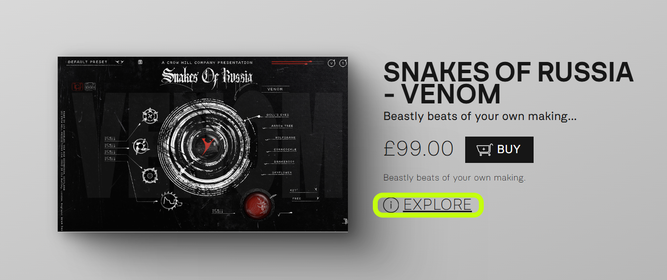
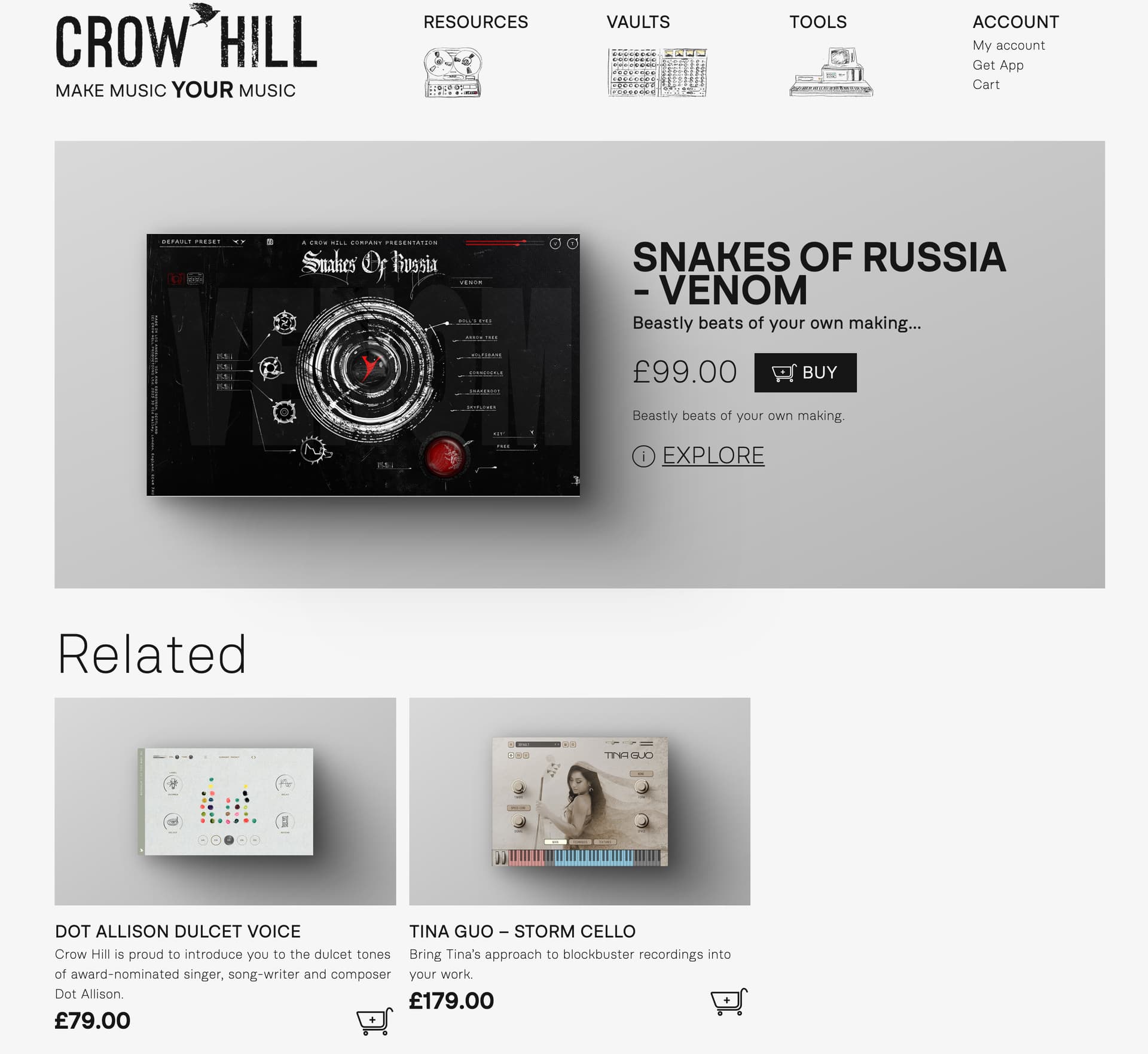
i) there is no cue on the Tools page to suggest clicking on the tool image will take you to more detail? is there a reason to leave a busy user to have to hack the page to click everything rather than have a word like “more…” on that image? Is the site instrumented so you can see what people do on that page? How many fails there might be where people get to that page but don’t get to the “more”? - not expecting a reply - just thoughts.
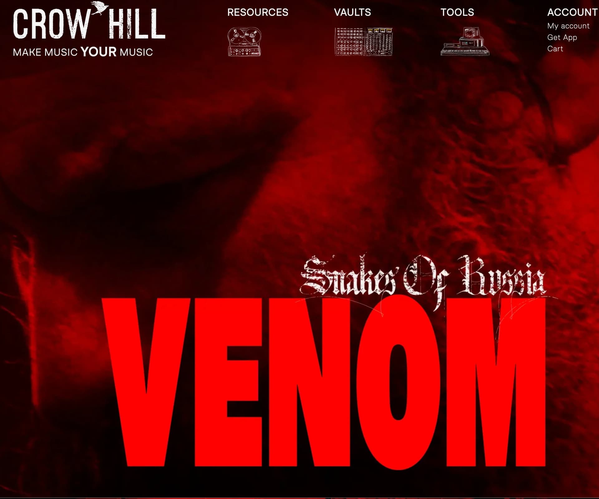
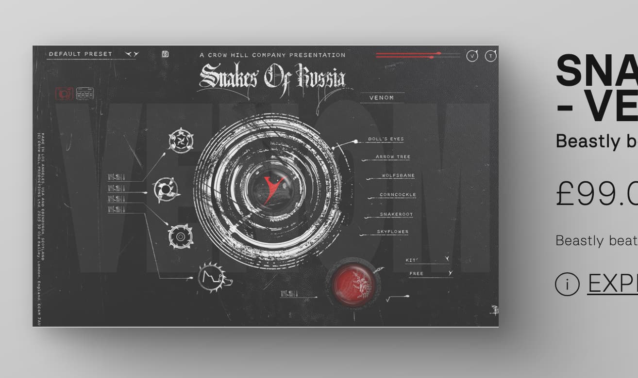
- IMAGE CLICK ON TOOLS to GET TO WHAT VALUE? - i sure missed that - and i was motivated - that said: the only thing that changes when clicking the image is that now a user has ANOTHER click to get this new page that only has ONE more piece of information - the word “explore” - that seems to be the only thing that changes - so still far away from goal…
and that Explore (i) is at least explicit and gets to what was desired from the tools page:
[HELPS]
It seems putting a word into the image or description on the tool page that cues a person to click on the image (or word) for more would be easy? - reduce people leaving?
Or perhaps have- the word “explore” to go right to the tool’s actual page?
Don’t quite grok with the intermediary page is supposed to be of
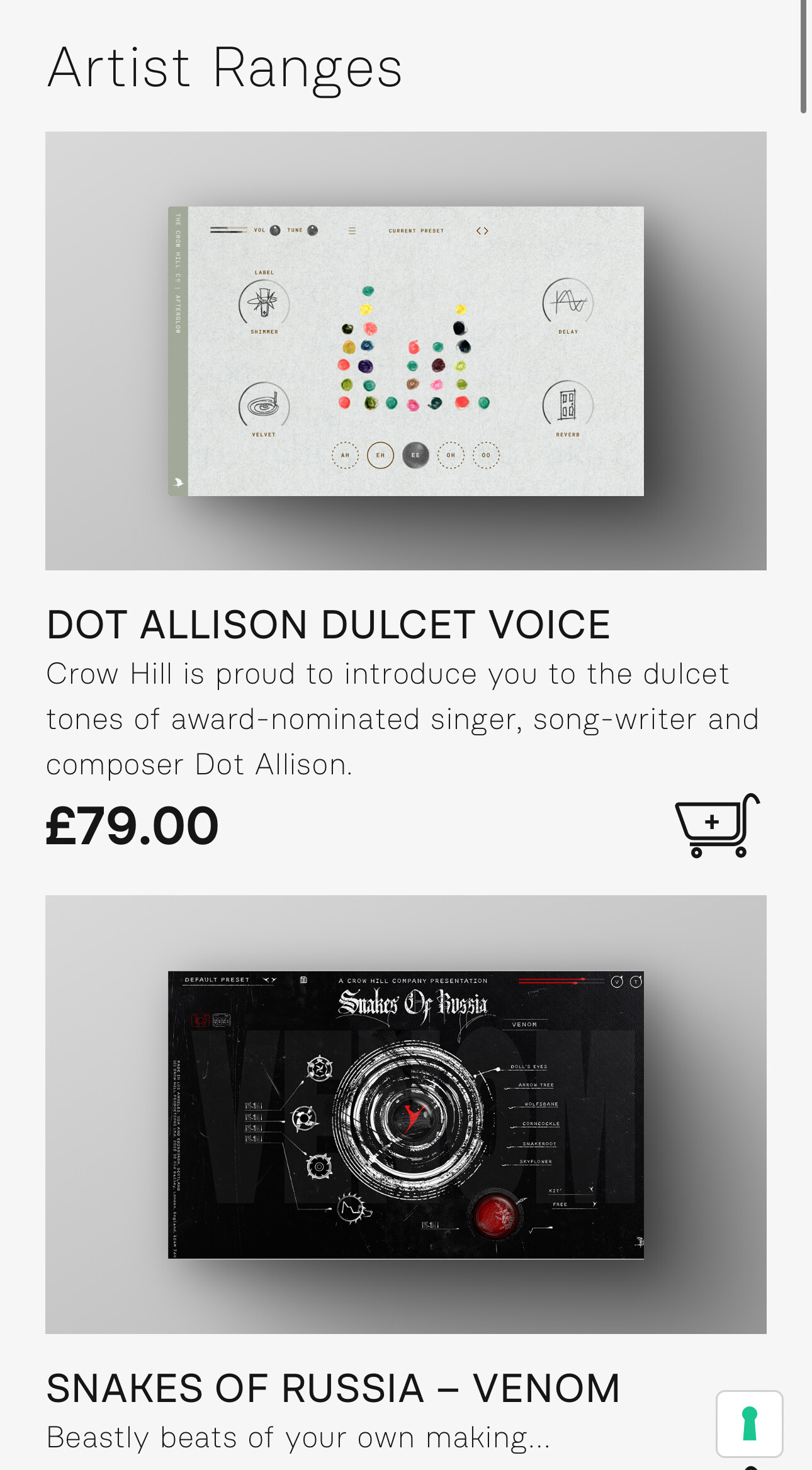
tools → tools/venom → tools/explore/venom
Rather than tools → tools/explore/venom.
it just seems an extra step that seems like one’s more or less on the same page still but for the appearance of a new word - and all the other vaults/tools now are gone… how does that middle page help you? do your stats show how many people go on to the next page - to the venom page? (again, just the sort of stuff might be interesting to know)
Also, the “click on the image to go to the Page” heuristic used on the Tools page seems to be broken on the tools/venom page - the image shows as clickable (cursor changes to hand/image greys over [see image or try yourself) but clicking does nothing.
so in one context clicking on an image does something; in another, nothing.
Is the heuristic when a direction word is there use it and when not click an image??
Apologies for these unrequested notes - but they are backup for the feedback - which was less about how to get to the page of interest but to help y’all understand why that at least for perhaps a few of your fans that was perhaps unduly opaque.
one heuristic in HCI/UX - of course is that what’s obvious for you mayn’t be for your enthusiasts/customers.
These thoughts are free and worth every penny.
Thank you for all the material/tools/wonder you’ve all shared here. Happy friday.
m.c.