Hi TCHC Team. Quick feedback on the new website. I’m 66, wear glasses and using an Android phone to view it. I’m struggling to read the grey text on grey background. Could the text be a little darker please?
Love the first O R I G I N S and it’s going to inspire me to make some more Kontakt instruments. The format is great.
It’s a little buried in the menus but you can change the look of the (forum) site with a little faffing. On PC, click your profile pic, then click Profile> Preferences >Interface
They have dark mode, WCAG options, and even a setting called “Dracula”.
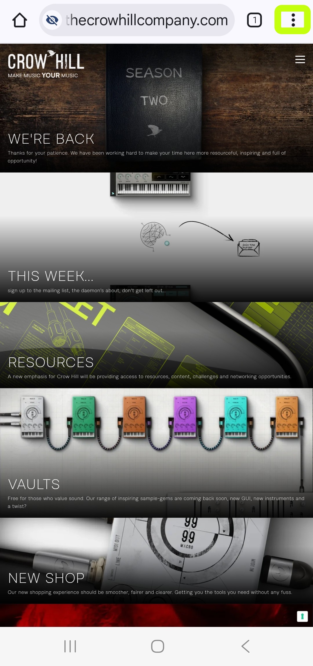
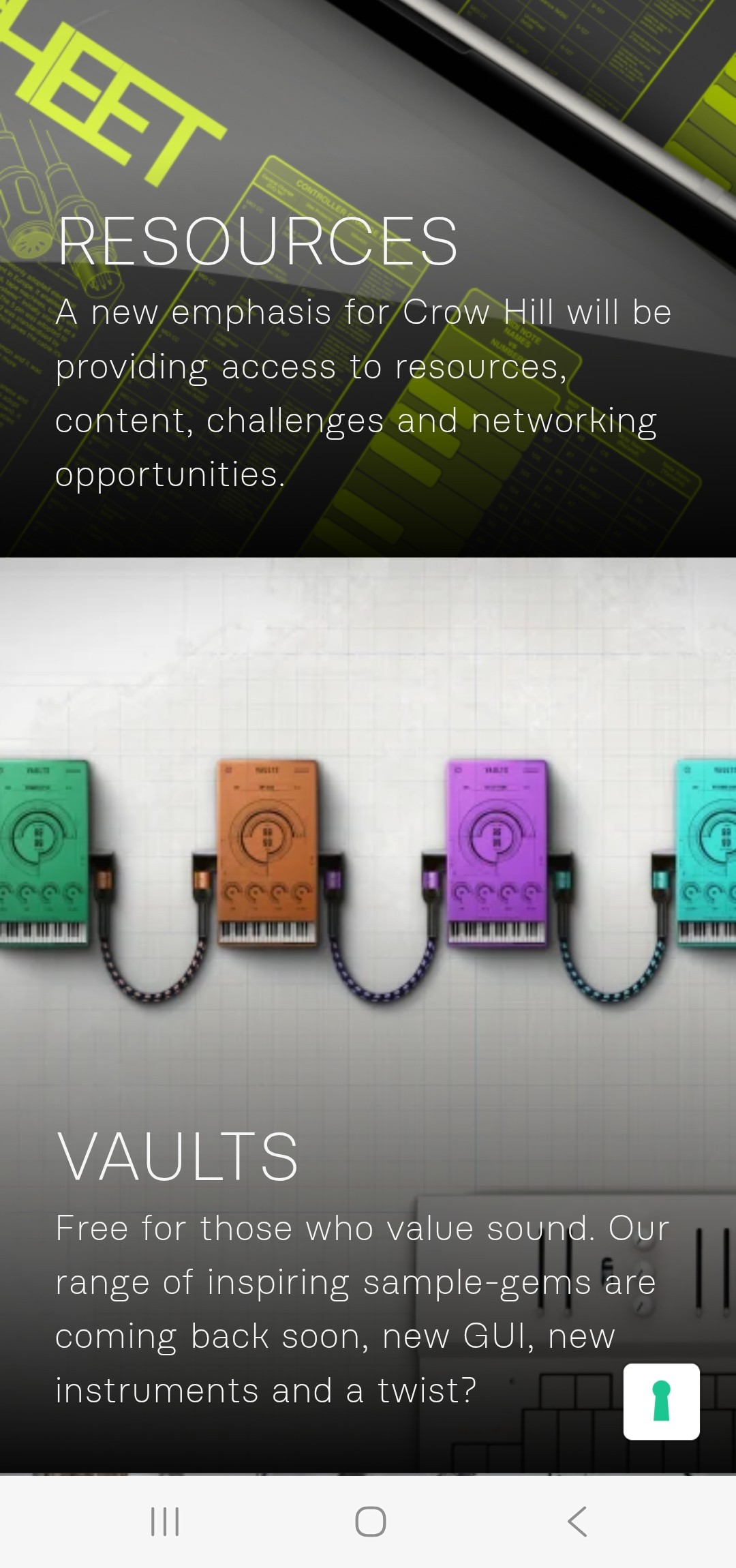
I like how the site is looking. One thought for later, when you have those nice little drawings like under “Resources”, “Vaults”, and “Tools”, my first inclination was that they must be icons instead of decorations. Perhaps add them as links to the same places the descriptions above link to. Same for any other places like that.